PowerBi Connects Dots 1
In most situations, it’s better to keep your reports clean and not overpowering. Remember that these dashboards are there to answer specific questions, mostly for managers.
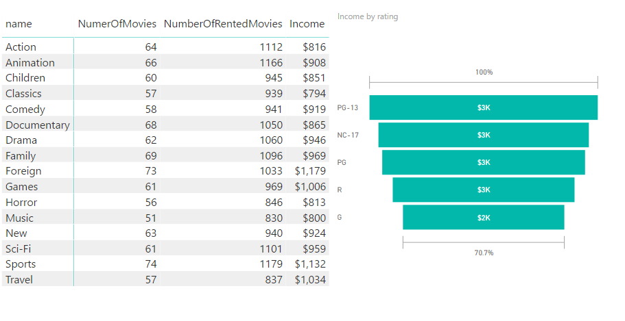
This is a simple matrix format and a funnel chart representation from the sakila database (very familiar to mySQL users!) which is hosted on my MS SQLServer locally, connected to power BI through direct query.
It calculates which categories are the most profitable and also shows which ratings bring in the most income. Note the column names are right! since I made the extra effort to make measures with the right names to represent the data. It further clarify things instead of using count of rent_id or …