
Comparison Between Shiny, Tableau, And Powerbi With A Shiny Example
Taha Monfared October 31, 2017
Shiny is the web platform provided by RStudio, which can run your R codes on a server and supports the interactive user interface. You cannot embed the outcomes on your website.
There are other routes available though, but not only on R. Tableau lets you publish your work on its servers as well, also you can embed its charts in your website. PowerBI allows you to share your work with whomever you choose, but they should also have PowerBI professional license. This is in your organization. For sharing it online, they have added the capability recently and you can embed your visualizations directly from the web outlet.
Here’s an example:
D3 javascript can handle inline visualization, and they are gaining popularity, but I haven’t had the chance to experience with it yet).
Positives about PowerBI and Tableau: They are mega ETL tools, which means you can extract data from multiple sources, make the data architecture right and create great reports. Their visual presentations are way-way more charming than R’s, and they support linked charts (I haven’t found a way to have this in R). Personally, I think PowerBI is 100 times more potent than Tableau, and if given a choice I wouldn’t even blink in choosing it over Tableau. Both can connect to every kind of data source known to me! Both have great visualizations.
Differences: Tableau has the story mode, a nifty tool. PowerBI makes data manipulation and transformation as easy as it can get. They knew the problems data sets have, with people having stored their data in untidy excel files for decades. And, they have come up with brilliant touches which makes data manipulation super easy. They also have a great Rserver integrated into PowerBI, which makes life beautiful! Whenever you can’t do your stuff with DAX and M, you can quickly shift to R for data manipulation and even visualization.
Shiny is just cool, since it only needs R. But, I hope they improve on it very soon. It’s going to have fierce competition in these platforms and the ones up and coming.
With all the limitations, I feel there is a need to make something robust that can embed your interactive work and dashboards and charts on the web. I’m sure there is something out there, but I haven’t discovered it yet.
Well, let’s go back to the Shiny app. As I’ve mentioned in R tricks, I wanted to showcase how you could use strings as input variables for functions. Let’s show it with a Dirichlet Process App which shows how a Dirichlet Process would estimate the underlying distribution. Building blocks of the Non-parametric Bayesian Data Analysis.
This first chunk of code is the heart of what is hosted on Shiny. The VisualizeDP function gets underlying distribution and Dirichlet alpha parameter from the user and generates a neat visualization of the Dirichlet process.
Note how it takes in text instead of parameters and the name of the distribution.
VisualizeDP<-function(dist, dist0, k, alpha,nsim, params = NULL, params0 = NULL){
  cdfplot<-function(base_sample, d = dist){
    c=1
    if(round(max(base_sample))-round(min(base_sample))<2){c=.25}
    xlabs<-round(seq(round(min(base_sample)),round(max(base_sample)),by = c),2)
    ylabs<-round(seq(0,1,by=.1),2)
    plot(ecdf(base_sample),axes = FALSE,col = alpha("blue",.6),
         main = paste("Dirichlet Process for", DistNames$Labels[which(DistNames$Dist==d)], "Distribution"),
         ylab = "Cumulative Probability", xlab = paste("Support \nalpha=",alpha),
         lty =1 , lwd = 2)
    axis(side = 1,labels = xlabs, at = xlabs)
    axis(side = 2,labels =  ylabs, at = ylabs)
  }

  samp<-eval(parse(text = paste0("r", dist, "(1000 ,",params,")")))
  cdfplot(samp)
  loc<-eval(parse(text = paste0("r", dist0, "(",k,",",params0,")")))
  loc<-sort(loc)
  G0<-eval(parse(text = paste0("c(p",dist0,"(loc[1],",params0,"),diff(p",dist0,"(loc,",params0,")),1-p",
                               dist0,"(loc[length(loc)],",params0,"))")))
  dpmean<-numeric(k+1)

  for (i in 1:nsim){
    dppars<-alpha*G0
    dp<-cumsum(rdirichlet(n=1,alpha = dppars))
    dpmean<-dpmean+dp
    lines(c(loc,Inf),dp,col=alpha("grey",.3))
    points(c(loc,Inf),dp,col=alpha("grey",.3),pch=19,cex = .2)
  }

  lines(c(-Inf,loc,Inf),c(0,dpmean/nsim),col = "orange",lty =1, lwd = 2)
  legend("topleft", c("Empirical CDF", "DP simulations", "Mean DP"),
         col = c(alpha("blue",.6), "grey", "orange"), lty = c(1,1,1), lwd = c(2,1,2),
         cex = .75 ,box.col = "transparent", bg = "transparent")
}
Now, shiny kicks in. You can read about how to set up your Shiny apps on the Rstudio website. The first part makes the user interface. It is pointing at the placeholders where each element should be, what inputs are needed from the user and an action button, which updates the chart.
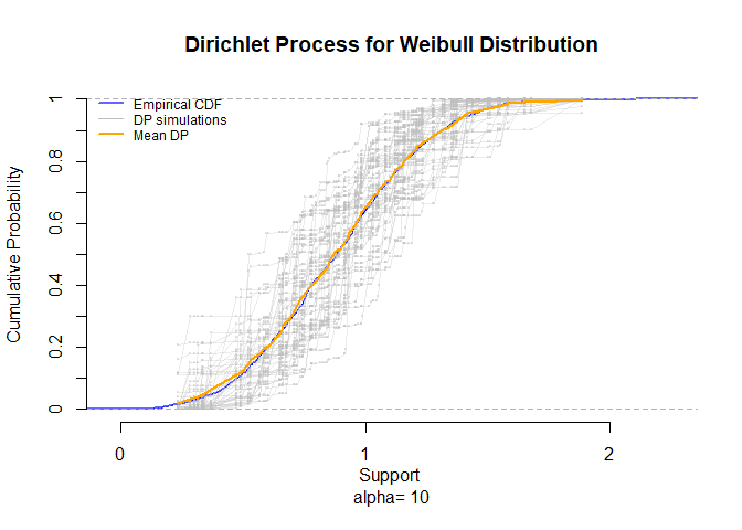
This is how the outcome should look like in a non interactive kind of situation. Also, a side by side view of the charts when changing the α parameter.
dist0<-dist<-"weibull"
params0<-params<-"shape = 3"

k<-100
nsim <-50

plot.new()
par(mfrow = c(3,3))
dict<-c(1,2,3,5,10,20,50,100,1000)
for (i in dict){
  VisualizeDP(dist,dist0,  k , alpha=i, nsim, params, params0)
}
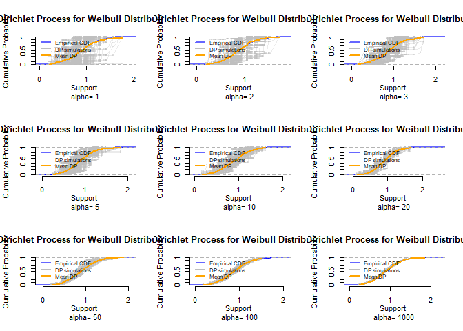
par(mfrow=c(1,1))
VisualizeDP(dist,dist0,  k , alpha=10, nsim, params, params0)
# Define UI for application that draws a histogram
ui <- fluidPage(

   # Application title
   titlePanel("Dirichlet Process Visualization"),

   # Sidebar with a slider input for number of bins
   sidebarLayout(
      sidebarPanel(
         selectInput("Dist",
                     "Distribution:",
                     multiple = FALSE,
                     choices = DistNames$Labels,
                     selected = "Uniform"),
         textInput("Params",
                   "Distribution Parameters (R):",
                   value = "min = 0, max = 1" ,
                   width = '100%'),
         sliderInput(inputId = "NumPoints",
                    "Points on the distribution:",
                     min = 10,
                     max = 100,
                     step = 10,
                     value = 50),
         sliderInput(inputId = "NumSims",
                     "Number of Dirichlet Samples:",
                     min = 10,
                     max = 200,
                     step = 10,
                     value = 50),
         sliderInput(inputId = "Alpha",
                     "Dirichlet Distribution Concentration Parameter:",
                     min = 10,
                     max = 300,
                     step = 10,
                     value = 20),
         actionButton("DPVizRender", "Update Plot")
      ),

      # Show a plot of the generated distribution
      mainPanel(
         plotOutput("DPViz")
      )
   )
)
After the UI, the server part of the Shiny kicks in. It now uses the inputs from the UI to generate the output on Rstudio servers.
Note the isolate(…) function in this part. It refers to the action button. It is saying that changing the parameters on the sidebar, does not affect anything before the update button is hit.
# Define server logic required to draw a histogram
server <- function(input, output) {
      output$DPViz <- renderPlot({
      input$DPVizRender
      isolate({
        nsim<-input$NumSims
        k<-input$NumPoints
        alpha<-input$Alpha
        dist0<-dist<-DistNames$Dist[which(DistNames$Labels==input$Dist)]
        params<-params0<-input$Params
        VisualizeDP(dist,dist0,  k , alpha, nsim, params, params0)})
      })
}
This following part knits the UI and server together.
# Run the application
shinyApp(ui = ui, server = server)
Shiny applications not supported in static R Markdown documents
You can see this app in action in my Shinyapps.io.
Comments