
Classification Part2
require(MASS)
require(MVN)
require(scales)
require(ggplot2)
require(dplyr)
source('http://www.public.iastate.edu/~maitra/stat501/Rcode/BoxMTest.R')
This time we’re going to explore other options for classification. Namely discriminant analysis and K nearest neighbors.
Again we prepare our data and make the test and train sets.
flea$type<-as.factor(flea$type)
flea$index<-1:nrow(flea)
rand<-sample(1:nrow(flea),5)
test<-flea[rand,]
train<-flea[-rand,]

X_range<-seq(min(flea$Y1),max(flea$Y1),length.out = 300)
Y_range<-seq(min(flea$Y2),max(flea$Y2),length.out = 300)
XY_grid<-expand.grid(X_range,Y_range)
XY_grid<-tbl_df(XY_grid)
names(XY_grid)<-c("Y1","Y2")
Linear Discriminant Analysis
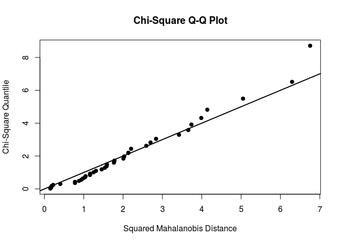
From the model selection part in the last post, we know Y1 and Y2 are enough for our classifications. So let’s test them for the assumptions of LDA. Namely, normality and constant covariance structure between categories of response.
mardiaTest(flea[,2:3],qqplot = TRUE)
##    Mardia's Multivariate Normality Test
## ---------------------------------------
##    data : flea[, 2:3]
##
##    g1p            : 0.5985517
##    chi.skew       : 3.890586
##    p.value.skew   : 0.4210159
##
##    g2p            : 6.540253
##    z.kurtosis     : -1.139515
##    p.value.kurt   : 0.2544886
##
##    chi.small.skew : 4.410381
##    p.value.small  : 0.3533067
##
##    Result         : Data are multivariate normal.
## ---------------------------------------
Our selected variables seem to be multivariate normal.
bx_test<-BoxMTest(flea[,2:3],flea[,1])
## ------------------------------------------------
##  MBox Chi-sqr. df P
## ------------------------------------------------
##     2.5738     2.4230           3       0.4894
## ------------------------------------------------
## Covariance matrices are not significantly different.
The covariances are not different so that we can perform LDA on the data. That’s good news, fewer parameters to estimate in the analysis!
let’s see how does the LDA predict.
lda_fit<-lda(data=flea,type~Y1+Y2,subset=6:39)

##to find the boundary
tmp<-data.frame(pred=predict(lda_fit)$x,Y1=flea$Y1[6:39],Y2=flea$Y2[6:39])
lm_line<-lm(data=tmp,LD1~Y1+Y2)
coef_line<-coef(lm_line)
lda_line<-function(Y1){(-coef_line[1]-coef_line[2]*Y1)/coef_line[3]}
x<-seq(min(flea$Y1),max(flea$Y1),length.out = 300)
y<-lda_line(x)
lda_pred<-data.frame(x,y)
####

ggplot()+geom_point(data=flea,aes(x=Y1,y=Y2,col=type))+theme_minimal()+
  geom_line(data=lda_pred,aes(x=x,y=y))+
  geom_text(data=flea[rand,],aes(x=Y1,y=Y2,label=index),nudge_x = 1,cex=2,col="black")
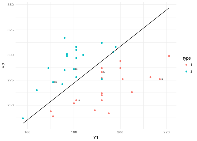
The boundary line is almost the same as the logistics regression boundary, with a small difference. Here the coefficients of the linear function are calculated based on MLEs based on normality assumption. Whereas in the glm, there were no such assumptions imposed on the data structure.
lda.pred = predict(lda_fit, test)
lda.class =lda.pred$class
table(lda.class , test[, 1] )
##
## lda.class 1 2
##         1 3 0
##         2 0 2
cat("Misclassification rate:",percent(mean(lda.class != test[, 1])))
## Misclassification rate: 0%
lda.pred = predict(lda_fit, train)
lda.class =lda.pred$class
table(lda.class , train[, 1] )
##
## lda.class  1  2
##         1 16  1
##         2  0 17
cat("Misclassification rate:",percent(mean(lda.class != train[, 1])))
## Misclassification rate: 2.94%
Bayes decision boundary is calculated by equating discriminant functions of two categories.
equating two class delta functions would result in:
which is basically a linear function of x.
To visualize the boundary line we had to find the intercept (the coefficients are given by the LDA function). So we ran a linear regression function to get that and made the function for the boundary line and voilà!
Quadratic Discriminant Analysis
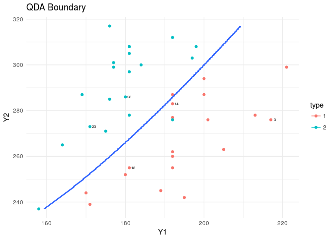
Let’s perform QDA and see what challenges we’ll face. First off, there is no boundary function output in the predict which makes it hard to draw it. So we need to use the contour plot to visualize the probabilities assigned, and the cutoff boundary mapped to the 2D plot.
tr<-setdiff(1:nrow(flea),rand)
qda_fit<-qda(data=flea,type~Y1+Y2,subset=tr)

####finding the boundary curve by using contour plot
XY_grid$type<-as.numeric(predict(qda_fit,XY_grid)$class)
pal<-c("dodgerblue3","deepskyblue2","darkolivegreen3","darkcyan",
       "goldenrod1","darkorange","deeppink2","darkorchid","lightblue3")

plt<-ggplot(data=flea,aes(x=Y1,y=Y2,col=type))+
  geom_point()+theme_minimal()+
  geom_text(data=flea[rand,],aes(x=Y1,y=Y2,label=index),nudge_x = 1,col="black",cex=2)
plt+stat_contour(data=XY_grid,aes(x=Y1,y=Y2,z=type))+
  labs(title="QDA Boundary")
####
Bayes decision boundary is derived from equating each group’s quadratic discriminant function δk to the other.
where μk, Σk, πk are all estimated based on the sample. The data is scaled in the QDA function. Scaling is first performed on the train set. Then each new point should be scaled based on mean and standard deviations calculated for the train data set. And then we can resume building our discriminant functions.
Then the mean and covariance matrix of each category is estimated by their MLEs from the sample.
Equating two functions will give us an ellipsoid function that looks like:
It’s not an easy task to draw this. So we’ll stick with drawing the contour.
I just provided functions to calculate QDA posterior probabilities to see how the scaling is working in the QDA function.
####Posterior Probabilities as calculated by qda

pi_tb<-train%>%group_by(type)%>%summarize(frq=n())%>%mutate(pi=frq/sum(frq))

tmp<-train[,2:3]
mu<-colMeans(tmp)
vars<-apply(tmp,2,sd)

sc<-train[,1:3]
sc[,2:3]<-scale(sc[,2:3])

tmp<-sc%>%filter(type=="1")
tmp<-tmp[,-1]
mu_1<-colMeans(tmp)
sol_sig_1<-solve(cov(tmp))
det_sig_1<-det(cov(tmp))

tmp<-sc%>%filter(type=="2")
tmp<-tmp[,-1]
mu_2<-colMeans(tmp)
sol_sig_2<-solve(cov(tmp))
det_sig_2<-det(cov(tmp))

post_1<-function(x){
  x<-as.matrix(x)
  x<-(x-mu)/vars
  exp(-1/2*matrix(x-mu_1,nrow=1)%*%sol_sig_1%*%matrix(x-mu_1,ncol=1))*
    (det_sig_1)^(-1/2)*(pi_tb$pi[1])
}

post_2<-function(x){
  x<-as.matrix(x)
  x<-(x-mu)/vars
  exp(-1/2*matrix(x-mu_2,nrow=1)%*%sol_sig_2%*%matrix(x-mu_2,ncol=1))*
    (det_sig_2)^(-1/2)*(pi_tb$pi[2])
}

posterior<-function(x){
  p<-numeric(2)
  p[1]<-post_1(x)
  p[2]<-post_2(x)
  p<-p/sum(p)
  return(p)
}

posterior(x=train[1,2:3])
## [1] 0.997881609 0.002118391
predict(qda_fit)$posterior[1,]
##           1           2
## 0.997881609 0.002118391
The probabilities calculated by hand and the qdaQDAfunction are the same! Thanks god for that!
Now let’s check the error of the prediction and fit by using QDA.
qda_pred = predict(qda_fit, test)
qda_class =qda_pred$class
table(qda_class , test[, 1] )
##
## qda_class 1 2
##         1 3 0
##         2 0 2
cat("Misclassification rate:",percent(mean(qda_class != test[, 1])))
## Misclassification rate: 0%
qda_pred = predict(qda_fit, train)
qda_class =qda_pred$class
table(qda_class , train[, 1] )
##
## qda_class  1  2
##         1 15  1
##         2  1 17
cat("Misclassification rate:",percent(mean(qda_class != train[, 1])))
## Misclassification rate: 5.88%
Note: In such small dataset with MVN test showing the data is normal, we prefer LDA to QDA.
K Nearest Neighbours
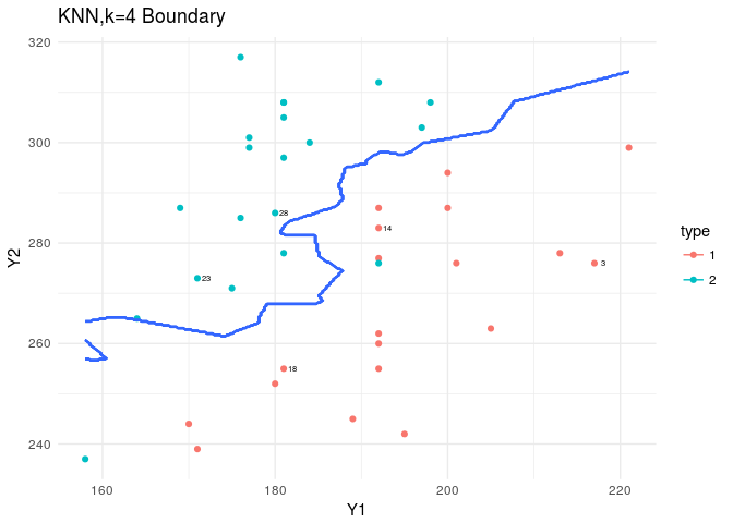
KNN is in the class package. Based on the nature of KNN we predict as we increase the K, we should see a smoother boundary.
require(class)

knn3<-knn(train[,2:3],test[,2:3],cl =train[,1],k = 3,prob = TRUE )
table(knn3 , test[, 1] )
##
## knn3 1 2
##    1 3 0
##    2 0 2
cat("Misclassification rate:",percent(mean(knn3 != test[, 1])))
## Misclassification rate: 0%
knn3<-knn(train[,2:3],train[,2:3],cl =train[,1],k = 3,prob = TRUE )
table(knn3 , train[, 1] )
##
## knn3  1  2
##    1 16  2
##    2  0 16
cat("Misclassification rate (for train set):",percent(mean(knn3 != train[, 1])))
## Misclassification rate (for train set): 5.88%
knn_plt<-knn(train[,2:3],XY_grid[,1:2],cl =train[,1],k = 3,prob = TRUE )
prob<-attr(knn_plt,"prob")
XY_grid$pred_knn<-ifelse(knn_plt=="1",prob,1-prob)
XY_grid$type<-ifelse(XY_grid$pred_knn<.5,1,2)

plt<-ggplot(data=flea,aes(x=Y1,y=Y2,col=type))+
  geom_point()+theme_minimal()+
  geom_text(data=flea[rand,],aes(x=Y1,y=Y2,label=index),nudge_x = 1,col="black",cex=2)
plt+stat_contour(data=XY_grid,aes(x=Y1,y=Y2,z=type))+
  labs(title="KNN,k=3 Boundary")
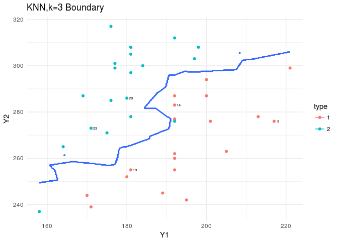
In plotting the boundary, you should consider that the prob attribute output for the KNN is strange. If it is 1, we should keep it as is. If it’s not 1, we should take 1-prob to be the assigned probability… nonsense!
knn4<-knn(train[,2:3],test[,2:3],cl =train[,1],k = 4,prob = TRUE )
table(knn4 , test[, 1] )
##
## knn4 1 2
##    1 3 0
##    2 0 2
cat("Misclassification rate:",percent(mean(knn4 != test[, 1])))
## Misclassification rate: 0%
knn4<-knn(train[,2:3],train[,2:3],cl =train[,1],k = 4,prob = TRUE )
table(knn4 , train[, 1] )
##
## knn4  1  2
##    1 16  2
##    2  0 16
cat("Misclassification rate (for train set):",percent(mean(knn4 != train[, 1])))
## Misclassification rate (for train set): 5.88%
knn_plt<-knn(train[,2:3],XY_grid[,1:2],cl =train[,1],k = 4,prob = TRUE )
prob<-attr(knn_plt,"prob")
XY_grid$pred_knn<-ifelse(knn_plt=="1",prob,1-prob)
XY_grid$type<-ifelse(XY_grid$pred_knn<.5,1,2)

plt<-ggplot(data=flea,aes(x=Y1,y=Y2,col=type))+
  geom_point()+theme_minimal()+
  geom_text(data=flea[rand,],aes(x=Y1,y=Y2,label=index),nudge_x = 1,col="black",cex=2)
plt+stat_contour(data=XY_grid,aes(x=Y1,y=Y2,z=type))+
  labs(title="KNN,k=4 Boundary")
knn5<-knn(train[,2:3],test[,2:3],cl =train[,1],k = 5,prob = TRUE )
table(knn5 , test[, 1] )
##
## knn5 1 2
##    1 3 0
##    2 0 2
cat("Misclassification rate:",percent(mean(knn5 != test[, 1])))
## Misclassification rate: 0%
knn5<-knn(train[,2:3],train[,2:3],cl =train[,1],k = 5,prob = TRUE )
table(knn5 , train[, 1] )
##
## knn5  1  2
##    1 16  2
##    2  0 16
cat("Misclassification rate (for train set):",percent(mean(knn5 != train[, 1])))
## Misclassification rate (for train set): 5.88%
knn_plt<-knn(train[,2:3],XY_grid[,1:2],cl =train[,1],k = 5,prob = TRUE )
prob<-attr(knn_plt,"prob")
XY_grid$pred_knn<-ifelse(knn_plt=="1",prob,1-prob)
XY_grid$type<-ifelse(XY_grid$pred_knn<.5,1,2)

plt<-ggplot(data=flea,aes(x=Y1,y=Y2,col=type))+
  geom_point()+theme_minimal()+
  geom_text(data=flea[rand,],aes(x=Y1,y=Y2,label=index),nudge_x = 1,col="black",cex=2)
plt+stat_contour(data=XY_grid,aes(x=Y1,y=Y2,z=type))+
  labs(title="KNN,k=5 Boundary")
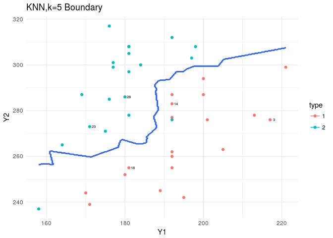
The boundaries produced by the KNN are mental… since this was not a complicated dataset and the LDA assumptions were met, we don’t need such highly volatile estimates for our boundaries. But this could become handy when we have a harsher dataset to analyze.
Every classifier we discussed here produced acceptable classifications. This was in part because of wise variable selection, and in part because of the distance between two categories. In this simple case of classification, based on our tests of our explanatory variables, I would have chosen LDA over all other.

Comments